Are these the five boldest and most unusual uniforms in baseball history?
Todd Radom, the designer behind the Angels logo, multiple All-Star Game logos, the World Baseball Classic logo and so much more, recently released "Winning Ugly," a look at the greatest, most outrageous and out-there uniforms in baseball history.
Some years ago, I owned a bulldog named Casey," Radom told MLB.com in a phone interview. "And people would come up while I was walking this dog on the street, and people would say 'She's so ugly, she's pretty,'"
"So, one person's ugly is another person's pretty."
In addition to his history with baseball design, Radom has worked in publishing, so he created his own illustrations to both pair with and supplement the Technicolor dreamscape in his book.
"The thing needed to look good because, obviously, I'm an aesthetic guy," Radom said.
Perhaps one of the most interesting revelations in the book is that our modern, internet age is not the first to obsess over uniforms. In fact, that's been the case ever since the Reds first donned a set look in 1866.
"I plowed through the newspaper archives and books to flesh out stuff that I wasn't necessarily familiar with," Radom pointed out. "I really wanted to show that people have cared about this kind of thing since the beginnings of the professional game. I dug really deep and found snarky opinions and pieces that eagerly described what the uniforms looked like dating back to the 1860s."
That included commentary on one of the great lost uniforms of all time: the black-and-yellow 1901 Baltimore Orioles, with fans and newspapers calling them the "Mustard Trousers," "Yellow Legs" and "Dandelions" for their audacious, Maryland state flag-inspired look.
That wasn't the only colorful uniform in the days of black-and-white photography. Sure, teams may not have had an array of alternate unis, but there was a time when each position had its own color-coordinated look.
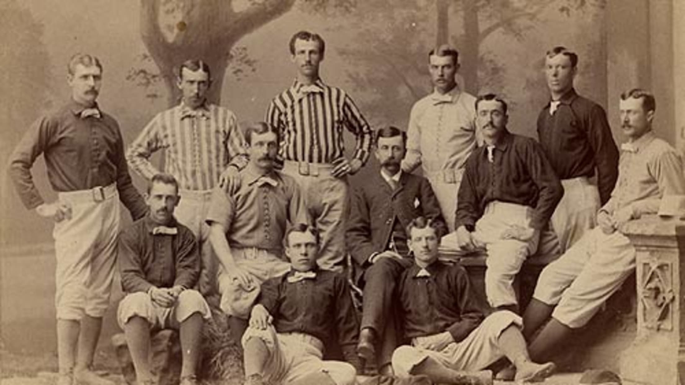
(1882 Wolverines, via Hall of Fame)
"When we envision the distant past, I certainly think about a world in black and white," Radom explained. "So, to really get that flavor and to get a sense of the fact that some of these uniforms were incredibly colorful and, yes, garish … was a little bit surprising," he joked.
Clearly the uniform experimentation that we've seen from teams like the D-backs isn't all that new, and, if anything, will likely continue into the future. "It's important to recognize that trends come and go. Especially in this moment of time when all of our attention spans are so greatly diminished, it only makes sense that our uniforms reflect that dynamic. The baseball season is 162 games, of course, and there is room for variation within that."
Given Radom's love for all kinds of unis, he was kind enough to tell us about his five favorite unusual looks. Here they are:
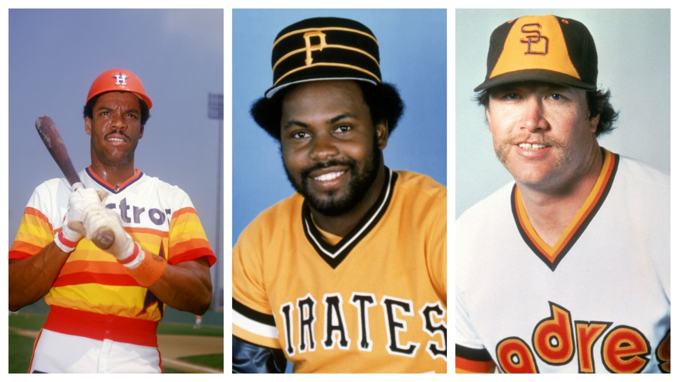
Astros (1975-86)
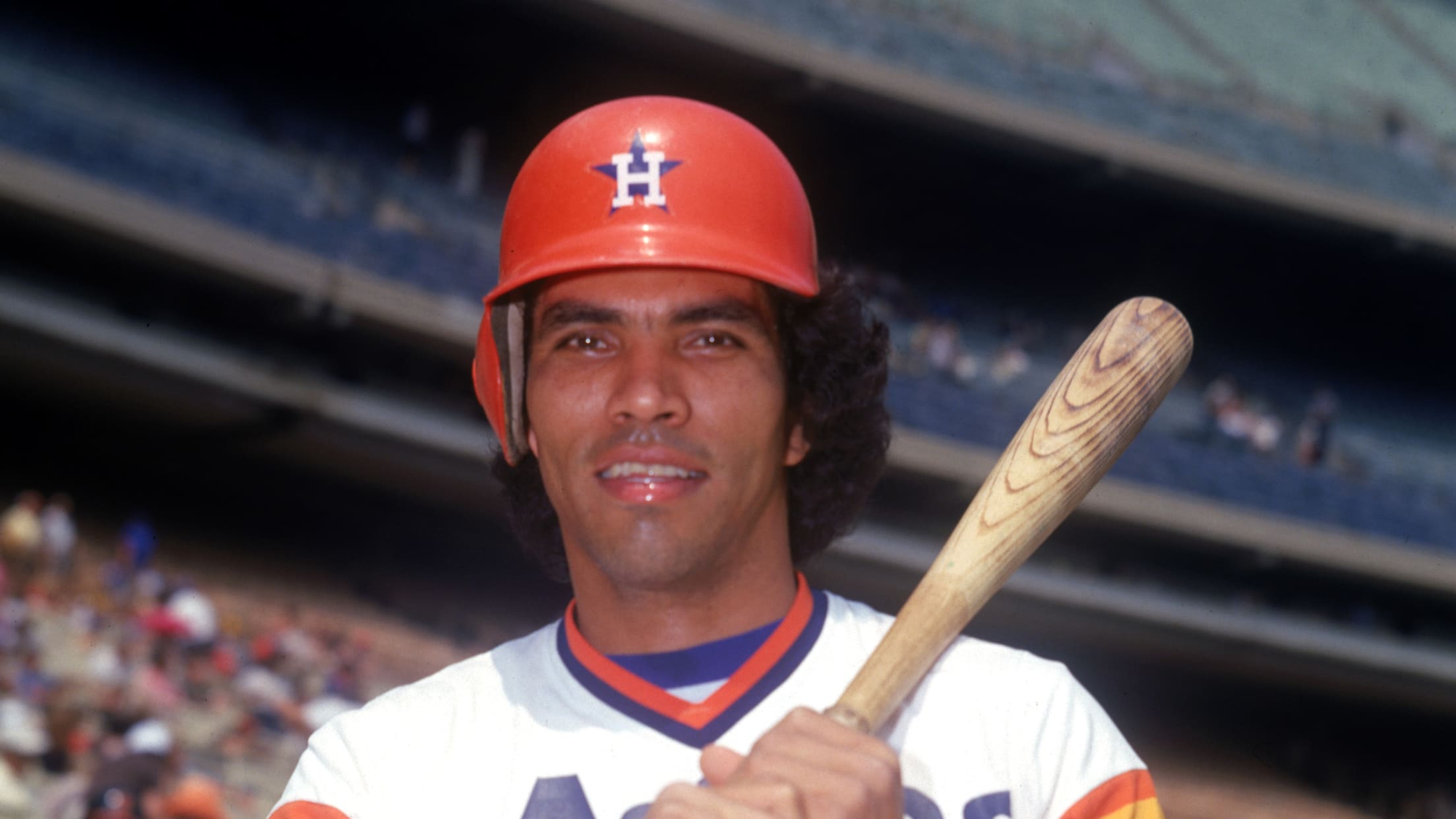
"You gotta respect the classics. Those are the most audacious, signature representation of any ballclub ever, I would say."
Braves (1972-75)
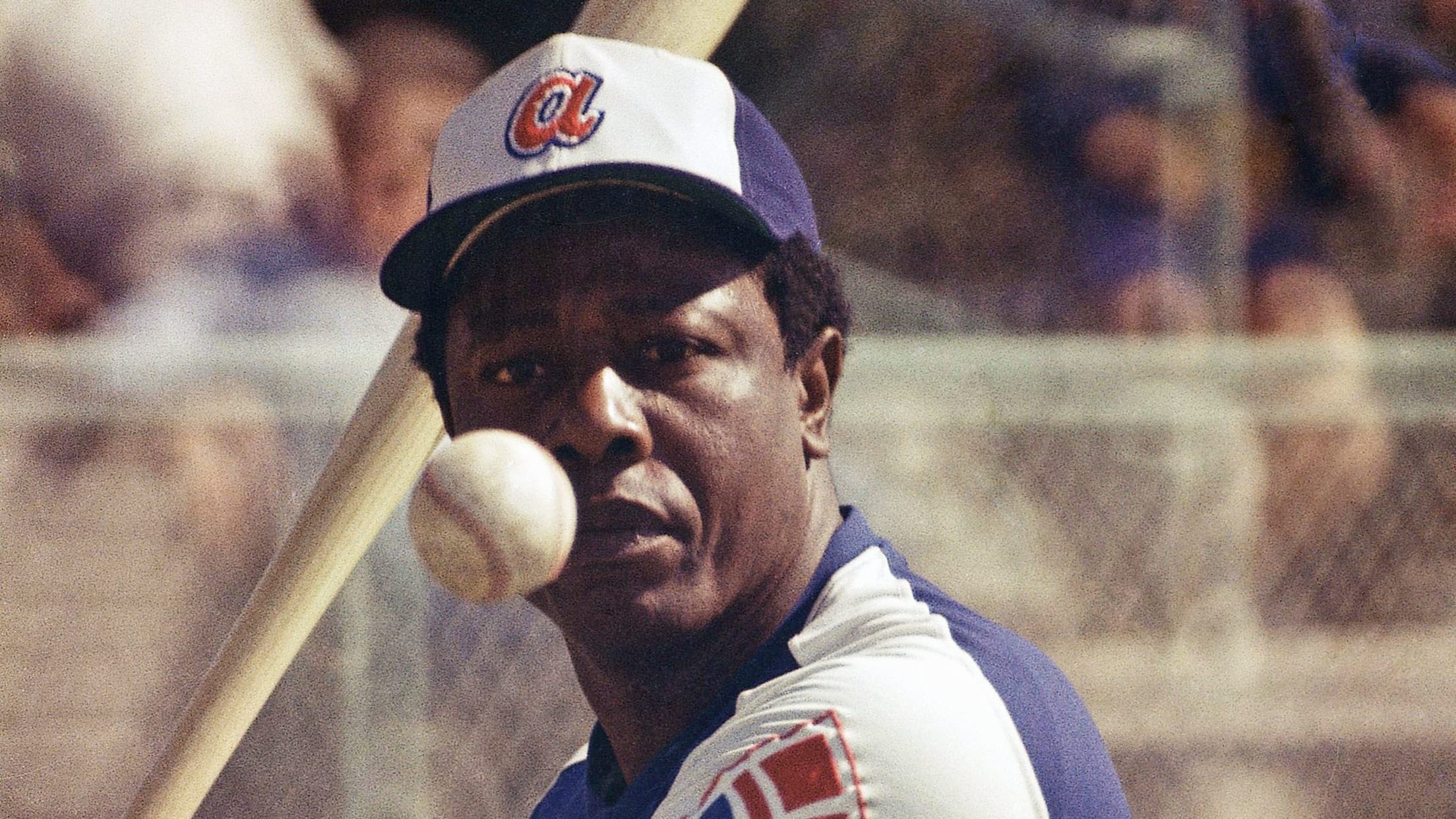
"The Hank Aaron-era Braves uniforms are decidedly not ugly. They are an elegant take on what the modern uniform could look like, and I love them."
Pirates (1977-1985)
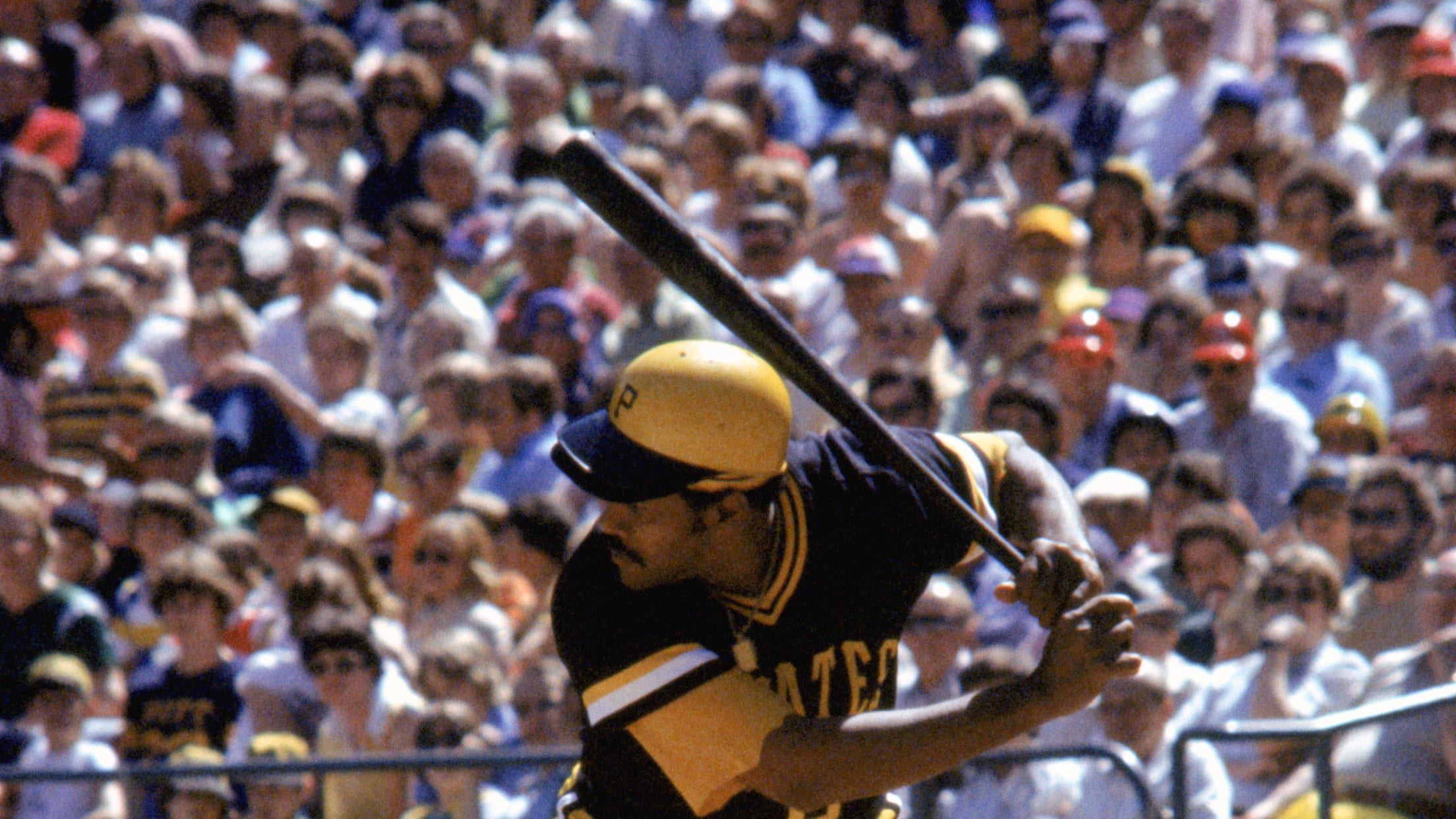
"I had to include the bumble-bee Pirates because of the mix-and-match possibilities [The book points out there were nine total combinations possible]. And because of the visage of some of the players that wore that uniform -- Willie Stargell, Kent Tekulve, Dave Parker."
D-backs Turn Ahead the Clocks (1999)
THE DIAMONDBACKS LITERALLY OWNED SWAG ON TURN AHEAD THE CLOCK pic.twitter.com/IO744hVGli
— bread perez (@bradxperez) November 14, 2013
"If you're going to have fun with it, you have to have fun with it. That's important to be in there."
Orioles (1901)
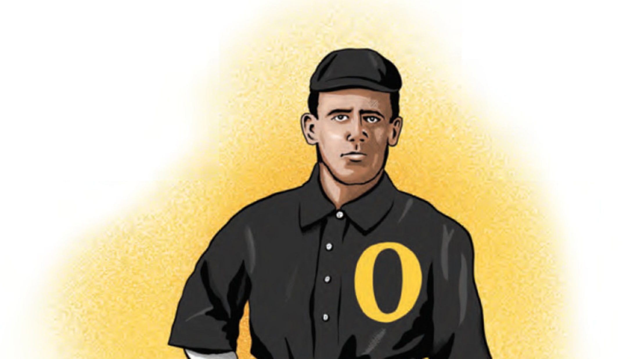
"They must have been really startling. [Turn of the century uniforms] were pretty much all block lettering, very conservative. Boy, those '01 Orioles, I would have liked to have seen those in person."
"Winning Ugly: A Visual History of the Most Bizarre Baseball Uniforms Ever Worn" is available now wherever the finest of books are sold.